August 2021 Updates
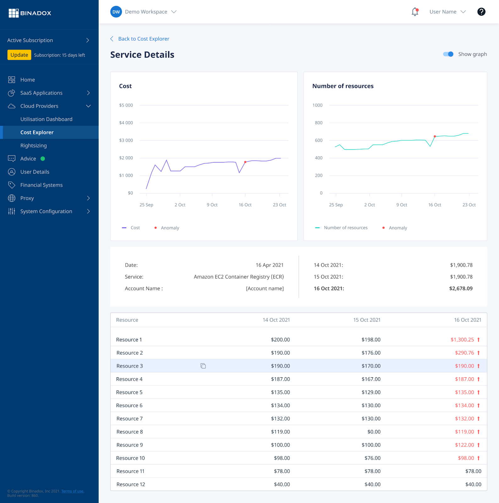
New Feature – Cost Explorer
Now you can explore costs within a chosen cloud account in detail, as well as compare the cost fluctuations over any 3 days period. For better visualization, the info can be presented in the form of a graph (once the switch is toggled on). It facilitates more precise cost allocation, brings clarity into your cloud spendings and the number of utilized resources, also, serves as a tool that makes you reconsider your spendings and more accurately plan your IT budget.
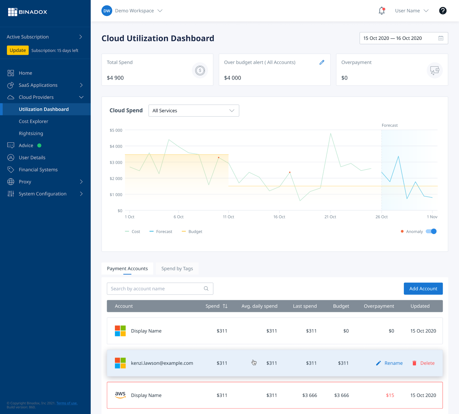
More Cost Details
In order to provide greater visibility on Cloud cost, we added 3 more parameters to Payment Accounts:
- Average Daily Spend, showing your spendings on the defined account on the daily basis;
- Budget, that displays the amount of money you set for the account;
- Overpayment – the sum that is beyond the planned budget.
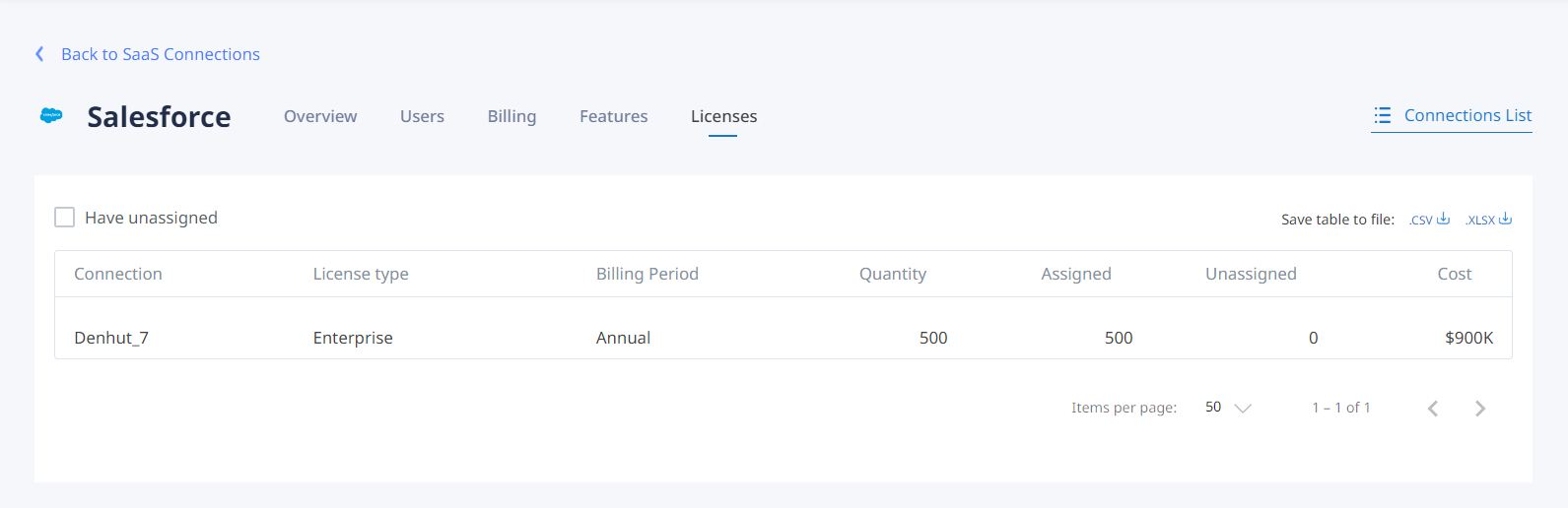
We’ve added more info on SaaS Applications as well to make the subscriptions and licenses management process easier. Now the app details page includes:
- Overview, where utilization rates are displayed;
- Users, showing the details of user’s activity;
- Billing tab that contains the info on the payment plan, billing period, number of licenses, their price, and currency;
- Features section (available for Zoom, Office 365, and Salesforce) includes the list of additional features within the purchased package together with their utilization rate. It allows companies to decide what package is optimal to use;
- Licenses tab – includes detailed info on the license type, billing period, quantity of licenses, and their cost.
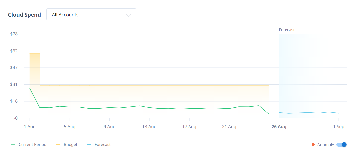
Budget History
In the Cloud Utilization Dashboard section, when choosing one of the accounts, you can see the graph, showing the cloud spend over the defined period. Moreover, now you can see the Budget History – the orange area which displays the changes in spending threshold set manually. It facilitates reporting for the FinOps team and illustrates the whole picture of financial assets consumption.